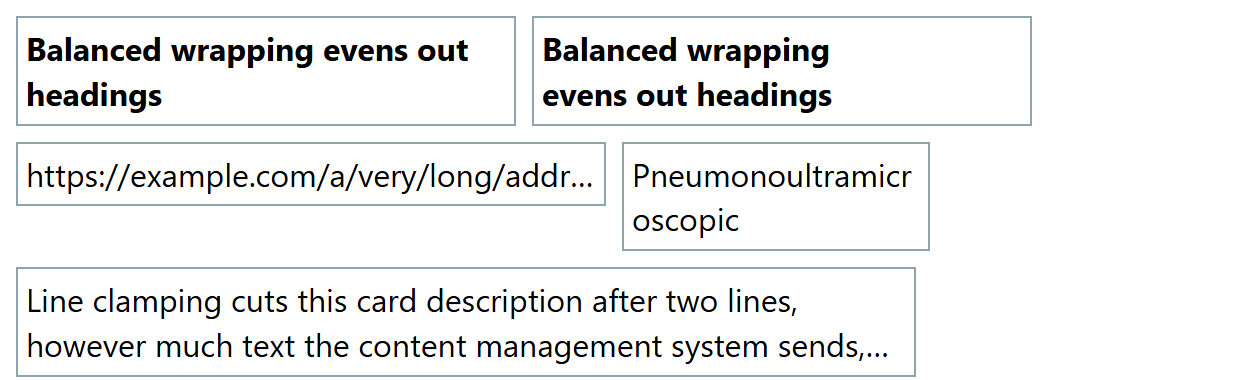
When text does not fit, clip it, break words or reshape the lines:
text-overflow: ellipsis marks clipped text on a nowrap line with overflow: hidden.
overflow-wrap: anywhere breaks a long word or URL only if it would overflow; word-break: break-all breaks anywhere.
hyphens: auto hyphenates using the dictionary for the element's lang attribute (Baseline widely available since March 2026).
text-wrap: balance evens out line lengths in headings (Baseline 2024); text-wrap: pretty avoids a lone last word in paragraphs (Chrome 1 , Safari 26 10 ; ignored elsewhere).
Unprefixed line-clamp is not Baseline yet; use the legacy -webkit-line-clamp trio below, which the spec keeps.
<style>
  body { font: 16px/1.4 system-ui; display: flex; flex-wrap: wrap; align-items: start; gap: 8px; }
  div, h3 { border: 1px solid #90a4ae; padding: 4px; margin: 0; font-size: 16px; }
  h3 { width: 240px; }  .b { text-wrap: balance; }  .brk { overflow-wrap: anywhere; width: 9em; }
  .ell { white-space: nowrap; overflow: hidden; text-overflow: ellipsis; width: 285px; }
  .cl { display: -webkit-box; -webkit-box-orient: vertical; -webkit-line-clamp: 2; }
</style>
<h3>Balanced wrapping evens out headings</h3><h3 class="b">Balanced wrapping evens out headings</h3>
<div class="ell">https://example.com/a/very/long/address/that/never/fits.html</div>
<div class="brk">Pneumonoultramicroscopic</div>
<div class="cl" style="width: 440px; overflow: hidden">Line clamping cuts this card description
  after two lines, however much text the content management system sends, with an ellipsis.</div>