Five properties belong to tables alone. border-collapse: collapse merges adjacent cell borders; the default separate keeps them apart by border-spacing: 4px 8px. caption-side: bottom moves the <caption>. empty-cells: hide hides empty cells' borders in separate mode. table-layout: fixed sizes columns from the table width and the first row only, so long content cannot widen a column and large tables render faster; the default auto reads every cell first.
<style>
  table { width: 280px; border-collapse: collapse; table-layout: fixed; font: 14px system-ui; }
  caption { caption-side: bottom; font-size: 12px; }
  th, td { border-bottom: 1px solid #cfd8dc; padding: 4px 8px; overflow-wrap: anywhere; }
  th { background: #37474f; color: #fff; text-align: left; }
  tr:nth-child(even) { background: #eceff1; }
  td:last-child, th:last-child { width: 60px; text-align: right;
    font-variant-numeric: tabular-nums; }
</style>
<table>
  <caption>Scores, fixed layout</caption>
  <thead><tr><th>Name</th><th>Score</th></tr></thead>
  <tbody><tr><td>Mike</td><td>90.5</td></tr><tr><td>Catherine</td><td>82.25</td></tr>
    <tr><td>TengkuAhmadIskandarShahIbrahim</td><td>73</td></tr>
    <tr><td>Alice</td><td>101.75</td></tr></tbody>
</table>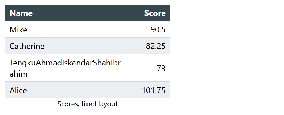
The long name wraps inside its column instead of stretching the table, and tabular-nums lines up the digits. For long tables, thead th { position: sticky; top: 0; } keeps the header in view, and wrapping the table in a <div> with overflow-x: auto lets it scroll sideways on phones.