A breakpoint is the width at which a media query changes the layout. Place it where the content breaks, not at device widths. Write it in rem: in media queries rem means the initial font size, so a reader with a larger default font gets the sidebar only when it has room. Bootstrap 2,007 uses 576-1,400px (Containers and Breakpoints), Tailwind CSS 40-96rem 5,202 .
<style>
  body { font: 15px system-ui; display: grid; gap: 6px; }
  body > * { background: #e3f2fd; padding: 8px; margin: 0; }
  @media (width >= 34rem) { body { grid-template-columns: 1fr 12rem } header { grid-column: 1/3 } }
</style>
<header>Header</header><main>Main: one column on a phone, the wide one from 34rem</main>
<aside>Aside: below main, then beside it</aside>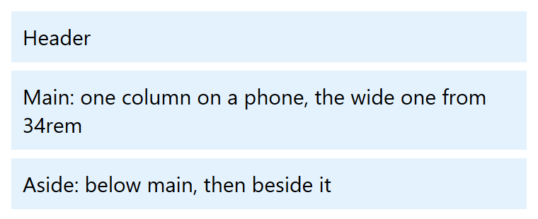
<style>
  body { font: 15px system-ui; display: grid; gap: 6px; }
  body > * { background: #e3f2fd; padding: 8px; margin: 0; }
  @media (width >= 34rem) { body { grid-template-columns: 1fr 12rem } header { grid-column: 1/3 } }
</style>
<header>Header</header><main>Main: one column on a phone, the wide one from 34rem</main>
<aside>Aside: below main, then beside it</aside>
Use range syntax: (width >= 34rem) and (width < 34rem) split cleanly, whereas max-width: 543px with min-width: 544px leaves fractional widths, common under zoom, matching neither. Three or four breakpoints usually suffice; components use container queries (Container Queries).