A transition interpolates a property whenever its computed value changes, through :hover, a toggled class or a script. The shorthand lists property, duration, timing function and delay: transition: width 3s linear 1s, opacity .3s. Declare it on the base state, not only on :hover, so the element animates back as well.
The timing function maps elapsed time to progress. ease (the default), ease-in, ease-out and ease-in-out are preset cubic-bezier() curves; steps(n) jumps, as sprite sheets need; and linear() (widely available since June 2026) runs through any list of points, so it can overshoot like a spring.
<style>
  body { font: 12px system-ui, sans-serif; margin: 10px 16px; }
  .row { display: grid; grid-template-columns: 190px 1fr; align-items: center; height: 36px; }
  .track { position: relative; height: 24px; border-bottom: 2px solid #ccc; margin-right: 90px; }
  i { position: absolute; left: 0; width: 22px; height: 22px; border-radius: 50%;
      background: #1565c0; opacity: calc(.25 + var(--t) * .75);
      animation: move 1s var(--ease) paused both;
      animation-delay: calc(-1s * min(var(--t), .999)); }
  @keyframes move { to { left: 100%; } }
</style>
<script>
  for (const e of ['linear', 'ease', 'ease-in-out', 'steps(4)', 'linear(0, 1.2 50%, .9, 1)'])
    document.write(`<div class="row"><code>${e}</code><div class="track">` + [0, .25, .5, .75, 1]
      .map(t => `<i style="--t:${t};--ease:${e}"></i>`).join('') + '</div></div>');
</script>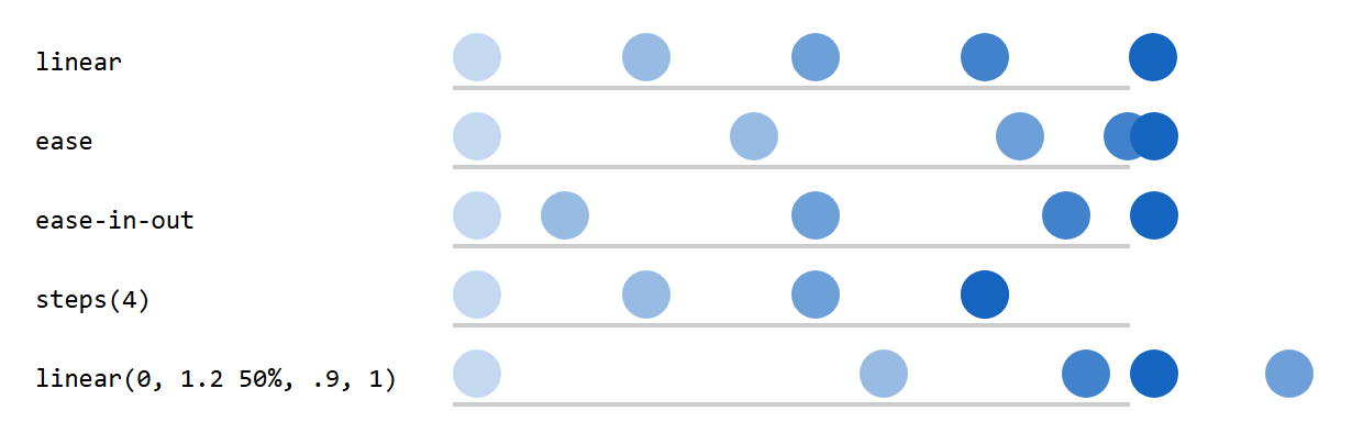
Each dot is an animation paused at a negative delay; the faintest dot is the start. steps(4) stays at 75% until the duration ends, and the linear() spring overshoots at 50%.
Discrete properties, `transition-behavior` and `@starting-style`
display and visibility cannot be interpolated. With transition-behavior: allow-discrete (Baseline 2024) they still transition: display flips to none at the end of the duration and away from none at the start, so the element stays rendered while opacity animates. A newly shown element has no "before" style; @starting-style (Baseline 2024) supplies one for its first style update.
[popover] {
  opacity: 0; translate: 0 -8px;                           /* exit (closed) state */
  transition: .25s allow-discrete; transition-property: opacity, translate, display, overlay;
}
[popover]:popover-open { opacity: 1; translate: 0 0;
  @starting-style { opacity: 0; translate: 0 8px; }        /* where the entry begins */
}
overlay keeps a closing popover in the top layer until the fade ends (Chromium 4,389 only). Pitfalls: height: auto does not interpolate in most browsers (transition grid-template-rows from 0fr to 1fr instead), transition: all animates properties you did not intend, and transitionend fires once per property.