@media applies nested rules when a media query is true: an optional type (screen, print) plus features in parentheses, joined by and, or, not, with commas meaning "any of these". The range syntax (width >= 600px) is Baseline widely available, and @media can nest inside a style rule.
<style>
  p { font: 20px system-ui; padding: 8px; background: #e3f2fd; }
  @media screen and (width < 600px), print and (orientation: portrait) {
    p { background: #fff3e0; }
  }
  .note { @media (width < 600px) { color: #ef6c00; font-weight: bold; } }
</style>
<p class="note">Orange background and bold orange text below 600px</p>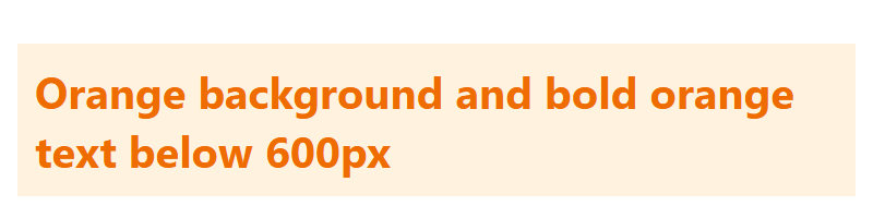
In legacy queries and binds first and a leading not negates the whole query: not screen and (color), print means "(not (screen and color)) or print". Preference features and breakpoints are in Media Queries.