Accessibility means that people who are blind, have low vision, are deaf, cannot use a mouse, or have cognitive disabilities can use your page. It is also widely neglected. The WebAIM 7,865 Million 2026 report, which runs automated tests on the home pages of the top one million websites, found detectable WCAG failures on 95.9% of them, with 56.1 errors per page on average. The most common were low-contrast text (83.9% of pages), images without alternative text (53.1%), inputs without labels (51%), empty links (46.3%), empty buttons (30.6%) and a missing lang attribute (13.5%). Each is a one-line fix in HTML.
It is increasingly the law, too. The European Accessibility Act, Directive (EU) 2019/882, has applied since 28 June 2025 to consumer services such as e-commerce, online banking, e-books and passenger transport information across the EU; microenterprises providing services (fewer than 10 staff, at most EUR 2 million turnover) are exempt. In the United States, the ADA Title II rule requires WCAG 2.1 Level AA for state and local government sites and apps, from 26 April 2027 for entities serving 50,000 people or more. Both, like most such rules, point at WCAG.
How assistive technology reads your page
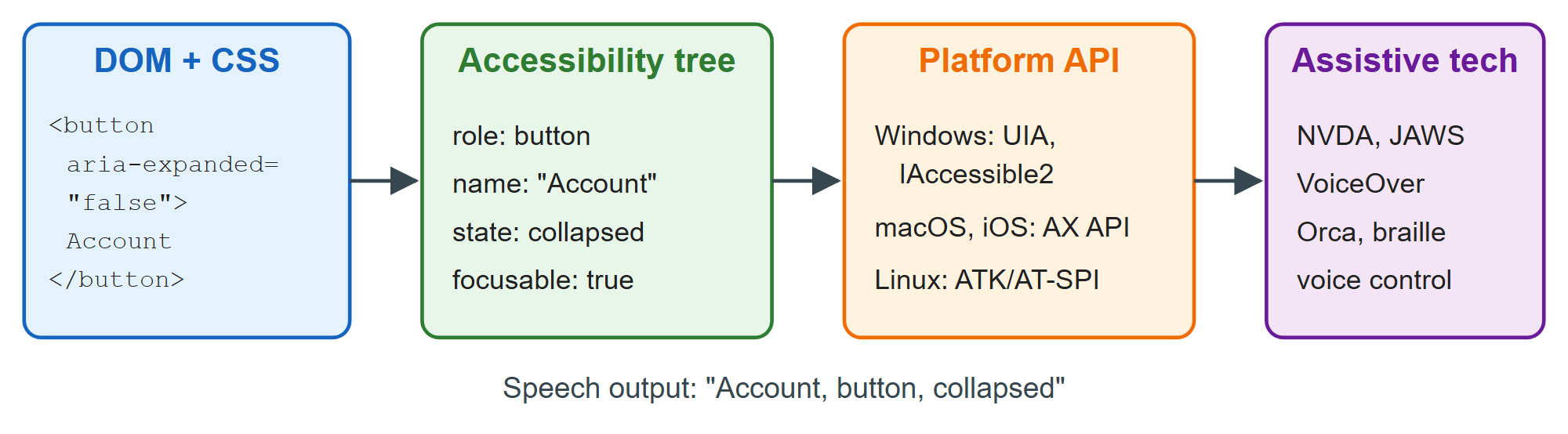
A screen reader never sees your pixels. The browser derives an accessibility tree from the DOM and CSS, in which each node has a role (button, link, heading), a name ("Search"), states (expanded, checked, disabled) and a value. It exposes that tree through the operating system's accessibility API, which the assistive technology queries. Chrome DevTools 3,948 shows each element's computed role and name in the Accessibility pane of the Elements panel.
WCAG 2.2 at a glance
The Web Content Accessibility Guidelines rest on four principles: content must be perceivable, operable, understandable and robust. Under them sit 13 guidelines and 86 testable success criteria at Level A (31), AA (24) or AAA (31). Laws almost always require Level AA, meaning all 55 A and AA criteria. WCAG 2.2 became a W3C Recommendation on 5 October 2023 and the international standard ISO/IEC 40500:2025 in October 2025. It dropped 4.1.1 Parsing, because browsers now repair malformed markup consistently, and added nine criteria:
| Criterion | Level | Requirement |
|---|---|---|
| 2.4.11 Focus Not Obscured (Minimum) | AA | Sticky bars never fully hide focus |
| 2.4.12 Focus Not Obscured (Enhanced) | AAA | No part of focus is hidden |
| 2.4.13 Focus Appearance | AAA | Large, high-contrast focus ring |
| 2.5.7 Dragging Movements | AA | Single-pointer alternative to dragging |
| 2.5.8 Target Size (Minimum) | AA | Targets 24 by 24 CSS px, or spaced |
| 3.2.6 Consistent Help | A | Help in the same place on every page |
| 3.3.7 Redundant Entry | A | Never ask for the same data twice |
| 3.3.8 Accessible Authentication (Minimum) | AA | No memory test to log in; allow paste |
| 3.3.9 Accessible Authentication (Enhanced) | AAA | No image-recognition test either |
WCAG 3 remains a W3C Working Draft (latest March 2026) with a scored model instead of pass/fail levels. No law references it yet, so build to WCAG 2.2 AA.
Accessible names and ARIA essentials
WAI-ARIA 1.2 (a W3C Recommendation since June 2023) adds attributes that change the accessibility tree without changing appearance or behavior. The specification calls it a supplement to native semantics, not a replacement, and the W3C's four rules of ARIA use say the same: use a native element whenever one exists; do not change native semantics (no <h2 role="tab">); make every ARIA control keyboard-operable; and never put aria-hidden="true" or role="presentation" on a focusable element. role="button" on a <div> adds no focus, no Enter or Space handling and no disabled state. ARIA is often misused: in the WebAIM Million, pages with ARIA averaged 59.1 errors against 42 on pages without it.
Every control needs an accessible name. The browser tries, in order, aria-labelledby, aria-label, native mechanisms (<label>, alt, <caption>, <legend>), the element's text content, and finally title or placeholder. Prefer visible text, and remember that aria-label on a button or link replaces its text.
| Attribute | Typical use |
|---|---|
| aria-label, aria-labelledby | Icon buttons; a dialog named by its heading |
| aria-describedby | Hint or error text under a field |
| aria-expanded, aria-controls | Disclosure buttons, menus, accordions |
| aria-pressed, aria-current="page" | Toggle buttons; the current navigation link |
| aria-invalid, aria-required | Form validation (Validation and Autofill) |
| role="status", role="alert", aria-live | Announcing changes without moving focus |
| aria-hidden="true" | Decorative icons next to text |
The listing combines them: a named icon button, a disclosure menu that reports its state, a field with a linked hint and error, and a status message. The script opens the menu and submits the empty field for the screenshot.
<style>
  body { font: 15px system-ui; margin: 12px; } button { font: inherit; padding: 6px 12px; }
  button:focus, input:focus { outline: 3px solid #1565c0; outline-offset: 2px; }
  [aria-invalid="true"] { border: 2px solid #c62828; } #err { color: #c62828; }
</style>
<button aria-label="Search"><svg aria-hidden="true" width="16" height="16">
  <circle cx="7" cy="7" r="5" fill="none" stroke="#000" stroke-width="2"/>
  <path d="M11 11l4 4" stroke="#000" stroke-width="2"/></svg></button>
<button id="acct" aria-expanded="false" aria-controls="menu">Account</button>
<ul id="menu" hidden>
  <li><a href="/profile">Profile</a></li> <li><a href="/logout">Sign out</a></li>
</ul>
<form id="f" novalidate>
  <label for="email">Email</label>
  <input id="email" type="email" required aria-describedby="hint err">
  <span id="hint">Used only for receipts.</span> <p id="err"></p>
  <button>Subscribe</button> <span role="status" id="status"></span>
</form>
<script>
  const acct = document.getElementById('acct'), menu = document.getElementById('menu');
  acct.onclick = () => {
    const open = acct.getAttribute('aria-expanded') !== 'true';
    acct.setAttribute('aria-expanded', open); menu.hidden = !open;
  };
  document.getElementById('f').onsubmit = (e) => {
    e.preventDefault();
    const email = document.getElementById('email'), ok = email.checkValidity();
    email.setAttribute('aria-invalid', !ok);
    document.getElementById('err').textContent = ok ? '' : 'Enter an email address.';
    document.getElementById('status').textContent = ok ? 'Subscribed.' : '1 error in the form.';
    if (!ok) email.focus();
  };
  acct.click(); document.querySelector('#f button').click(); // show the states
</script>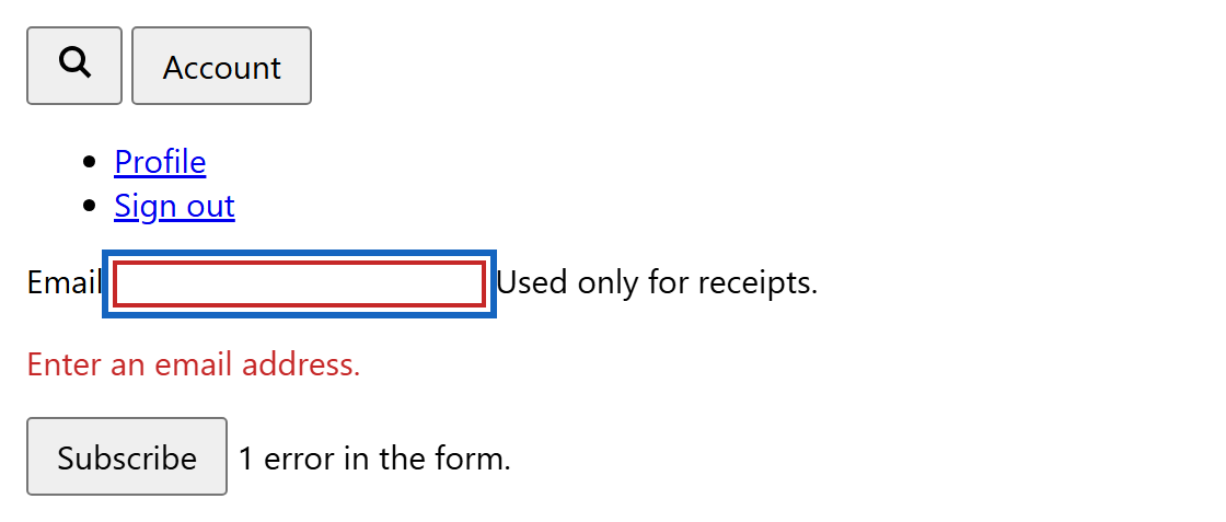
A screen reader announces the icon as "Search, button", the next control as "Account, button, expanded", and the field as an invalid, required "Email" edit box followed by its hint and error. The role="status" span is a polite live region, read out after the current announcement. Put live regions in the initial HTML and change only their text: a region inserted together with its message is often missed.
Testing tools
Automated checkers catch missing names, contrast failures and invalid ARIA in seconds, but Deque, maker of axe-core 7,562 , estimates they find about 57% of WCAG issues. Whether alt text is meaningful or a custom widget really works needs a human with a keyboard and a screen reader.
| Tool | Licence, price | Best for |
|---|---|---|
| axe-core (https://github.com/dequelabs/axe-core 7,562 ) | MPL-2.0, free | Test engine for Playwright 26,280 , Cypress 41,181 , Jest 62,362 |
| Lighthouse 30,824 (https://github.com/GoogleChrome/lighthouse 30,824 ) | Apache-2.0, free | Scored audit in DevTools (runs axe-core) |
| Pa11y 4,560 (https://github.com/pa11y/pa11y 4,560 ) | LGPL-3.0, free | Command-line scans of many URLs |
| WAVE 7,865 extension (WebAIM) | Free; API paid per credit | Error icons overlaid on the page |
| NVDA 29,469 (https://github.com/nvaccess/nvda 2,643 ) | GPL-2.0, free | Windows screen reader testing |
| VoiceOver | Built into macOS, iOS | Safari 10 and iPhone testing |
| JAWS 51,382 (Freedom Scientific) | Commercial | Widely used in enterprises |
axe-core runs inside the page: it walks the DOM, computes roles and names with its own implementation of the W3C algorithms, and measures contrast against the colors actually painted behind the text. This demo loads it from jsDelivr 15,886 (in a project, npm 2,036 install axe-core) and lists the WCAG A and AA violations in a broken snippet.
<div id="bad" style="font: 15px system-ui">
  <img src="data:image/svg+xml,%3Csvg xmlns='http://www.w3.org/2000/svg'%3E%3Ccircle cx='20' cy='20'
    r='18' fill='%232e7d32'/%3E%3C/svg%3E" width="40" height="40">
  <input type="text" placeholder="Name"> <button><svg width="16" height="16"></svg></button>
  <span style="color: #aaa">Low-contrast fine print</span>
</div>
<ol id="out" style="font: 14px system-ui"></ol>
<script src="https://cdn.jsdelivr.net/npm/axe-core@4.13.0/axe.min.js"></script>
<script>
  axe.run('#bad', { runOnly: ['wcag2a', 'wcag2aa'] }).then(({ violations }) => {
    document.getElementById('out').innerHTML = violations
      .map((v) => `<li><b>${v.id}</b> (${v.impact}): ${v.help}</li>`).join('');
  });
</script>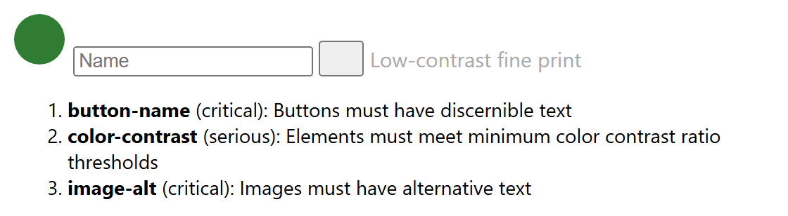
Note what axe did not report: the placeholder gives the input an accessible name, so it passes, even though a placeholder that vanishes on typing is a poor label. Only a human catches that, so build a routine:
Run axe-core in end-to-end tests (@axe-core/playwright or cypress-axe) so regressions fail the build.
Put the mouse away and Tab through every page: focus must be visible, logical, never trapped and never hidden under a sticky header.
Listen. In NVDA (free), NVDA+F7 lists links, headings and landmarks; on a Mac, Command-F5 starts VoiceOver and Control+Option+U opens its Rotor with the same lists. Then zoom to 400% and check nothing is cut off.