A 2,000-pixel photo suits a desktop hero but wastes mobile data on a phone showing it 375 pixels wide. Resolution switching serves the same picture at different pixel sizes and lets the browser pick (srcset, sizes); art direction serves different crops for different layouts, chosen by you (<picture>, media).
A fixed-size image such as a logo needs only density descriptors: srcset="logo-200.png 1x, logo-400.png 2x". A fluid image uses width descriptors (each file's real pixel width) plus sizes, the width of the image slot, because the browser picks a file while parsing, before CSS layout exists. sizes lists media conditions with lengths (px, em, vw, calc(), but not percentages); the first match wins and the default is 100vw.
The same markup on other devices shows why the phone, at full width on a 3x screen, deserves a 1200w candidate.
| Device | Viewport, DPR | Slot | Pixels needed | File chosen |
|---|---|---|---|---|
| Phone | 375 px, 3x | 100vw = 375 px | 1,125 | 800w (largest) |
| Laptop | 1,280 px, 1x | 280 px | 280 | 320w |
| Desktop | 1,440 px, 1.5x | 280 px | 420 | 480w |
The demo prints currentSrc, the URL actually chosen, under each image (the renderer uses a 2x screen).
<!doctype html>
<html lang="en">
  <meta charset="utf-8">
  <base href="https://cdn.jsdelivr.net/gh/mdn/learning-area@main/html/multimedia-and-embedding/">
  <style>
    body { font: 13px system-ui, sans-serif; margin: 10px; display: flex; gap: 12px;
           align-items: start; }
    figure { margin: 0; } img { display: block; height: auto; }
    figcaption { font: 12px monospace; }
  </style>
  <figure>
    <img srcset="responsive-images/elva-fairy-320w.jpg 320w,
                 responsive-images/elva-fairy-480w.jpg 480w,
                 responsive-images/elva-fairy-800w.jpg 800w"
         sizes="(width <= 600px) 100vw, 160px" src="responsive-images/elva-fairy-480w.jpg"
         width="480" height="320" style="width: 160px" alt="Girl in a fairy costume">
    <figcaption></figcaption>
  </figure>
  <figure>
    <picture>
      <source media="(width <= 500px)" srcset="responsive-images/elva-480w-close-portrait.jpg"
              width="480" height="552">
      <img src="responsive-images/elva-800w.jpg" width="800" height="464" style="width: 200px"
           alt="Elva and her father">
    </picture>
    <figcaption></figcaption>
  </figure>
  <script>
    addEventListener('load', () => {
      for (const img of document.images) {
        img.closest('figure').querySelector('figcaption').textContent =
          `DPR ${devicePixelRatio}: ${img.currentSrc.split('/').pop()}`;
      }
    });
  </script>
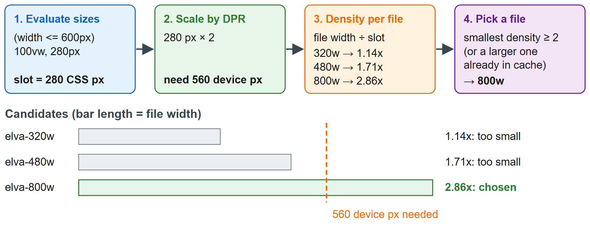
The 160 px slot needs 320 device pixels and gets the 320w file; change both to 280 px and it switches to 800w, as in the diagram. The second figure is art direction: at 500 px or narrower the matching <source> supplies a portrait close-up, and at 720 px the <img> falls back to the wide shot. Only the <img> renders, so alt, loading, styles and listeners belong on it; width and height on each <source> reserve that crop's aspect ratio.
For lazy images, sizes="auto" uses the real rendered width, since they load after layout. It works in Chrome 126 1 + and Firefox 150 555 +; other browsers skip auto and use the fallback lengths after it: sizes="auto, 280px".
Pitfalls: a wrong sizes silently wastes bytes, so compare img.currentSrc with the rendered width; never mix w and x descriptors in one srcset; and preload a responsive LCP image with imagesrcset and imagesizes on <link rel="preload"> (Performance Hints in Markup).