<img> is a void element that embeds one picture from src (a URL, or a data: URL for tiny icons). alt replaces the image for screen readers, search engines and broken connections, so describe what it means in context ("Chart: sales doubled in Q3"). Decorative images get alt=""; with no alt at all, some screen readers read out the file name.
Always set width and height to the intrinsic pixel size, even when CSS resizes the image. Browsers derive a default aspect-ratio from them and reserve space before a byte arrives, avoiding the jumps Core Web Vitals measure as Cumulative Layout Shift; with img { max-width: 100%; height: auto; } the reserved box scales with the layout.
Three attributes tune loading: loading="lazy" defers the download until the image nears the viewport (Baseline widely available), fetchpriority="high" or "low" hints network priority (Baseline 2024), and decoding="async" lets the page paint before the image is decoded. srcset and sizes get Responsive Images in Depth; crossorigin is needed before a <canvas> may read the pixels.
<figure> wraps self-contained content that the text refers to, such as an image, a chart, a code listing or a quote, and <figcaption> (first or last child) captions it. The caption becomes the figure's accessible name. An image map makes regions of one image clickable: <map name="room"> holds <area> elements with shape="rect", "circle" or "poly", pixel coords and an href, and the image points to it with usemap="#room".
<!doctype html>
<html lang="en">
  <meta charset="utf-8">
  <base href="https://cdn.jsdelivr.net/gh/mdn/learning-area@main/html/multimedia-and-embedding/">
  <style>
    body { font: 14px/1.4 system-ui, sans-serif; margin: 10px; display: flex; gap: 16px; }
    img { display: block; height: auto; }
    figure { margin: 0; }
    .hero img { width: 200px; }
    figcaption { font-size: 13px; color: #37474f; padding-top: 4px; }
  </style>
  <figure class="hero">
    <!-- Above the fold: likely LCP, so load early and at high priority -->
    <img src="responsive-images/elva-480w-close-portrait.jpg" width="480" height="552"
         alt="A father holding his smiling daughter in a garden" fetchpriority="high">
    <figcaption>The hero image loads first.</figcaption>
  </figure>
  <figure>
    <!-- Below the fold on a real page: lazy, decoded off the main paint -->
    <img src="responsive-images/elva-fairy-480w.jpg" width="480" height="320" usemap="#room"
         alt="A girl in a fairy costume sitting on a red sofa" loading="lazy" decoding="async">
    <map name="room">
      <area shape="rect" coords="5,20,50,180" href="#books" alt="Bookshelf">
      <area shape="circle" coords="222,105,48" href="#face" alt="The girl's face">
    </map>
    <figcaption>Click the bookshelf or the face.</figcaption>
  </figure>
  <script>document.querySelector('area[shape="circle"]').focus();</script>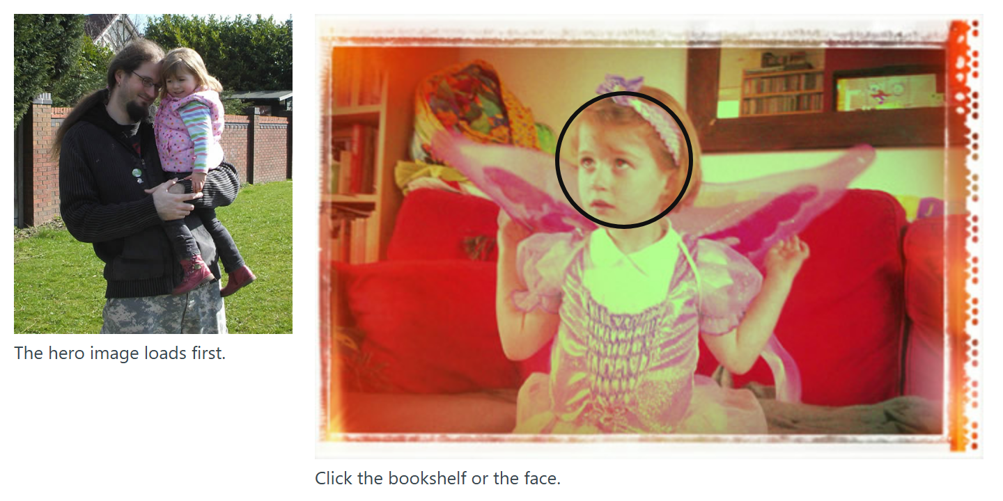
The script focuses the circular <area> to show the focus ring around its clickable region. <area> shares href, target, download and rel with <a> (Hyperlinks) and needs its own alt. Its coordinates are intrinsic pixels, so the map drifts off a CSS-scaled image; for responsive hotspots, position links over the image or use inline SVG. The ismap attribute (server-side maps) is legacy.
Lazy loading and fetch priority in practice
Never lazy-load the Largest Contentful Paint image; give it fetchpriority="high" instead. On Google Flights this moved LCP from 2.6 s to 1.9 s.
Lazy-load images further down. Chrome 1 fetches them once within 1,250 px of the viewport on fast connections (2,500 px on 3G or slower).
Lazy loading only works with JavaScript enabled; the standard requires this so that a server cannot track the scroll position of script-blocking users. The old lazysizes polyfill is no longer needed.
Use fetchpriority="low" for images in later, hidden carousel slides.