For decades <select> was the control designers gave up on: the operating system drew it, <option> held only text, and the fix was a JavaScript widget that reimplemented keyboard handling and accessibility. One CSS declaration, appearance: base-select, switches a real <select> to a stylable rendering built from ordinary boxes, and the HTML parser now keeps elements such as <img> and <span> inside <option> instead of discarding them.
<style>
  body { font: 15px system-ui; margin: 12px; display: flex; gap: 24px; align-items: start; }
  select, ::picker(select) { appearance: base-select; }
  select { border: 2px solid #1565c0; border-radius: 10px; padding: 6px 10px; min-width: 210px; }
  select::picker-icon { color: #1565c0; }
  select:open::picker-icon { rotate: 180deg; }
  ::picker(select) { border-radius: 10px; box-shadow: 0 6px 20px #0003; }
  option { display: flex; gap: 8px; align-items: center; padding: 6px 10px; }
  option:checked { background: #e3f2fd; font-weight: 600; }
  option::checkmark { order: 1; margin-left: auto; color: #2e7d32; }
  select[size] { height: auto; }
  selectedcontent { display: flex; gap: 8px; align-items: center; }
  .dot { width: 12px; height: 12px; border-radius: 50%; background: var(--c); }
  small { color: #607d8b; }
</style>
<select name="status">
  <button><selectedcontent></selectedcontent></button>
  <option value="open"><span class="dot" style="--c:#2e7d32"></span>Open</option>
  <option value="review" selected>
    <span class="dot" style="--c:#ef6c00"></span>In review <small>2 approvals</small></option>
  <option value="closed"><span class="dot" style="--c:#6a1b9a"></span>Closed</option>
</select>
<select name="labels" size="3">
  <option value="bug" selected><span class="dot" style="--c:#c62828"></span>bug</option>
  <option value="docs"><span class="dot" style="--c:#1565c0"></span>documentation</option>
  <option value="help"><span class="dot" style="--c:#2e7d32"></span>help wanted</option>
</select>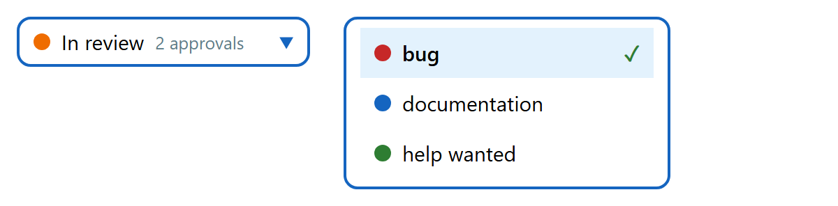
The optional <button> as the first child replaces the default button, and <selectedcontent> inside it receives a copy of the chosen option's content, dot included. Clicking opens the drop-down, styled through ::picker(select); ::picker-icon is the arrow, ::checkmark the mark beside the chosen option, and :open matches while the picker shows. With size or multiple the same styles apply to an in-page list box, which Chrome 1 added in version 145 (February 2026). A browser without support ignores the CSS and the <button> and shows an ordinary select with the options' text, so the form keeps working.
Support in September 2026: Chrome and Edge 135 (April 2025), Opera 120 89 and Samsung Internet 29 94 ; Safari 27 10 , in beta since June 2026; Firefox 555 only behind a preference. Use @supports (appearance: base-select) if the fallback must look different, and follow WebKit 15,343 's "golden rule": every option needs real text, not just an icon.
More modern form features
field-sizing: content makes inputs, textareas and selects grow with their content, retiring auto-growing textarea scripts. It became Baseline in June 2026 with Firefox 152 (Interface).
<input type="checkbox" switch> draws a native on/off switch with the switch role; only Safari 17.4 and later support it so far, and other browsers show a normal checkbox.
input.showPicker() opens a date, color, file or datalist picker from your own button's click handler (Baseline since 2022).
Native controls still lack a searchable combo box with tagging and date range pickers. For those, open-source libraries such as Tom Select 2,228 (https://github.com/orchidjs/tom-select 2,228 ) (Apache-2.0, npm 2,036 install tom-select) and flatpickr 16,466 (https://github.com/flatpickr/flatpickr 16,466 ) (MIT, npm install flatpickr) enhance an existing <select> or <input> (new TomSelect('#labels')), so the form still submits the usual fields.