Browsers validate forms before they send them. You declare the rules as attributes, the browser checks them when the user submits, focuses the first invalid control, shows a message in the user's language, and cancels the submission. This constraint validation costs no JavaScript, and a small API lets you customize every step. It never replaces server-side validation: anyone can edit the HTML in DevTools or send a request with curl 3,008 .
| Constraint | Applies to | ValidityState flag |
|---|---|---|
| required | Most controls | valueMissing |
| type="email", type="url" | Those types | typeMismatch |
| pattern="[A-Z]{3}-\d{4}" | Text-like types | patternMismatch |
| min, max | Numbers, ranges, dates | rangeUnderflow, rangeOverflow |
| step | Numbers, ranges, dates | stepMismatch |
| minlength, maxlength | Text types, <textarea> | tooShort, tooLong |
| Unparseable input, e.g. letters typed in a date | Date, number | badInput |
| setCustomValidity("message") | Any control | customError |
pattern must match the whole value, as if wrapped in ^(?:...)$, and it is compiled with the regular expression v flag, so characters such as -, ( and | need escaping inside a character class. Disabled and readonly controls, hidden inputs and type="button" or "reset" inputs are never validated. Add novalidate to the form, or formnovalidate to one submit button, to switch validation off.
The Constraint Validation API
Every control exposes validity (a ValidityState with the flags above plus valid), validationMessage, willValidate, checkValidity(), reportValidity() and setCustomValidity(); the form has the two check methods too. checkValidity() returns a boolean and fires an invalid event on each failing control; reportValidity() also shows the browser's message. A non-empty custom message keeps the control invalid until you set it back to "".
const form = document.createElement('form');
form.innerHTML = `<input name="email" type="email" required>
  <input name="age" type="number" min="18">
  <input name="code" pattern="[A-Z]{3}-\\d{4}"><input name="pw2" type="password">`;
const { email, age, code, pw2 } = form.elements;
[email.value, age.value, code.value] = ['ana@', '17.5', 'abc-12'];
pw2.setCustomValidity('Passwords do not match.');   // e.g. after comparing with the first field
const flags = (el) => Object.keys(ValidityState.prototype).filter((k) => el.validity[k]);
for (const el of [email, age, code, pw2]) {
  console.log(`${el.name}: [${flags(el)}] ${el.validationMessage}`);
}
console.log('form valid:', form.checkValidity());email: [typeMismatch] Please enter a part following '@'. 'ana@' is incomplete. age: [rangeUnderflow,stepMismatch] Value must be greater than or equal to 18. code: [patternMismatch] Please match the requested format. pw2: [customError] Passwords do not match. form valid: false
The messages come from Chrome 1 and differ in other browsers and languages; for a pattern mismatch the bubble may also show the title text. Styling follows the same state: :invalid matches immediately, which paints an empty required field red before the user has typed anything, while :user-invalid waits until the user has changed the field and left it, or tried to submit (Baseline since November 2023; Input Selectors covers these selectors).
<style>
  body { font: 15px/1.4 system-ui, sans-serif; margin: 12px; }
  input { font: inherit; display: block; width: 260px; border: 1px solid #889; padding: 3px; }
  input:user-invalid { border: 2px solid #c62828; background: #ffebee; }
  input:user-valid { border: 2px solid #2e7d32; }
  label, .err { display: block; margin-bottom: 4px; }
  .err { color: #c62828; font-size: 13px; }
</style>
<form id="signup">
  <label>Email <input name="email" type="email" required autocomplete="username">
    <span class="err"></span></label>
  <label>Password (8+ characters)
    <input name="pw" type="password" minlength="8" required autocomplete="new-password">
    <span class="err"></span></label>
  <button>Create account</button>
</form>
<script>
  const form = document.getElementById('signup');
  form.addEventListener('invalid', (e) => {       // invalid does not bubble: listen in capture
    e.preventDefault();                           // suppress the browser bubble
    e.target.nextElementSibling.textContent = e.target.validationMessage;
  }, true);
  form.addEventListener('input', (e) => {
    e.target.setCustomValidity('');
    e.target.nextElementSibling.textContent = '';
  });
  form.elements.email.value = 'ana@example.com';
  form.elements.pw.value = 'short';               // minlength only checks user edits...
  form.elements.pw.setCustomValidity('Use at least 8 characters.');   // ...so flag it here
  form.requestSubmit();                           // runs validation like a click on the button
</script>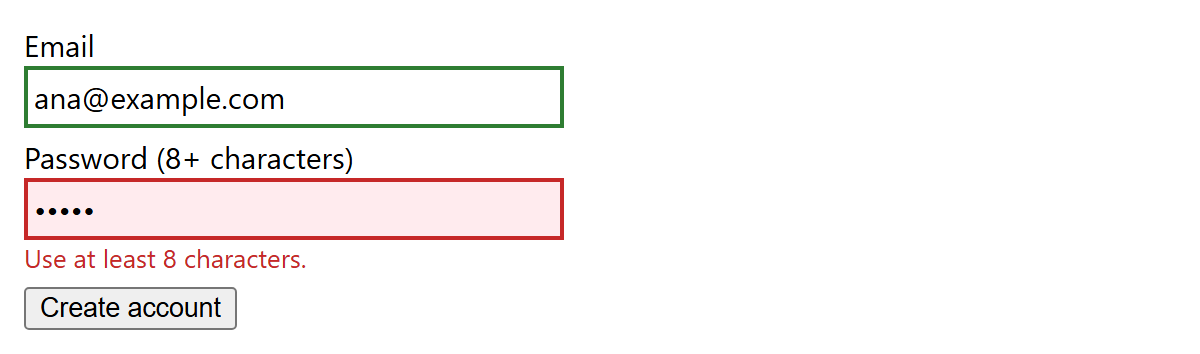
minlength and maxlength check only values the user typed, not values set by script, which is why the demo sets a custom error. requestSubmit() validates and fires submit; form.submit() skips both.
Autofill
The autocomplete attribute tells browsers and password managers what a field holds, so they can fill a whole address or card in one tap. Beyond on and off it takes standardized tokens such as name, email, tel, street-address, postal-code, cc-number, username, current-password, new-password and one-time-code. Prefixes scope a token: shipping postal-code, work tel, or section-guest1 email when one page holds two people's details. webauthn goes last, as in autocomplete="username webauthn": when the page calls navigator.credentials.get() with mediation: 'conditional', saved passkeys appear among the suggestions.
Practical Advice
Validate on the server too, and map its errors back onto fields with setCustomValidity() plus reportValidity(), so both kinds of error look the same.
Browsers mark filled fields with :autofill; keep that highlight visible so users can review what was filled.