<body> holds everything the user sees. Inside it, a small set of elements describes what role each block plays. They look identical to <div> until you style them, but browsers, reader modes, search engines and screen readers treat them differently, so choose by meaning, never by appearance. The layout below uses most of them. To save space, this and the following rendered listings show only a <style> block and the body content; wrap them in the skeleton from Anatomy of an HTML Document when you use them.
<style>
body { font: 15px/1.4 system-ui; margin: 0; display: grid; grid-template-columns: 1fr 170px; }
header, footer { grid-column: 1 / -1; background: #1565c0; color: #fff; padding: 6px 14px; }
header h1 { margin: 0; font-size: 20px; } nav a { color: #fff; margin-right: 12px; }
main, aside { padding: 0 14px; } aside { background: #fff3e0; font-size: 13px; }
article { border: 1px solid #ccc; padding: 0 10px; } h2, h3 { margin: 8px 0 4px; }
p { margin: 4px 0; } hr { border: 0; border-top: 2px dotted #999; }
</style>
<header>
<h1>Trail Notes</h1>
<nav aria-label="Primary">
<a href="/">Home</a><a href="/hikes">Hikes</a><a href="/gear">Gear</a>
</nav>
</header>
<main>
<article>
<h2>Crossing the Ridge in October</h2>
<p>The first frost arrived early, and the path above the tree line was glazed by 7 a.m.</p>
<hr>
<section>
<h3>What to pack</h3>
<p>Microspikes, a spare layer and twice the water you think you need.</p>
</section>
</article>
</main>
<aside><h2>Related</h2><p>Choosing trekking poles</p><p>Reading a topo map</p></aside>
<footer><small>© 2026 Trail Notes</small></footer>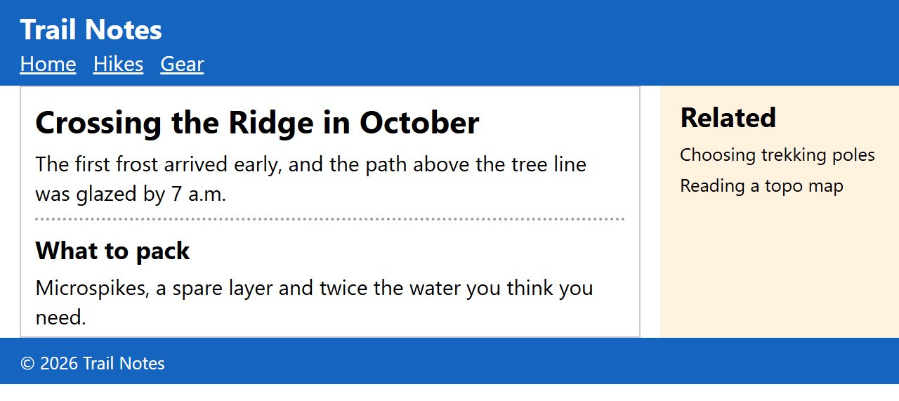
<main> wraps the content unique to this page, excluding repeated headers, navigation and footers. A document may have only one visible <main>, and it must not sit inside <article>, <aside>, <header>, <footer> or <nav>. A "skip to content" link should point at it.
<header> and <footer> hold introductory and closing content for the page or for the nearest article or section, so an article can have its own. Neither may contain another <header> or <footer>.
<nav> marks major navigation blocks: the site menu, a table of contents, pagination. A list of social links in the footer does not need one. When a page has several, name them with aria-label.
<aside> is content tangentially related to its surroundings: a sidebar, a pull quote, a glossary box.
<article> is self-contained content that would make sense on its own in a feed or on another site: a blog post, a forum reply, a product card, a comment. Articles can nest (comments inside a post).
<section> is a thematic group of content that normally starts with a heading. The specification says it "is not a generic container element": if you need a wrapper only for styling or scripting, use <div>, the element of last resort that carries no meaning at all.
<p> is a paragraph of phrasing content, and <hr> is a thematic break between paragraphs, such as a scene change, rather than a decorative line. Its old size, width, noshade and color attributes are obsolete; style it with CSS as the listing does.
details and dialog
Two sectioning-level elements are interactive without a line of JavaScript. <details> is a disclosure widget: its first child <summary> is the always-visible label, and clicking it toggles the open attribute and fires a toggle event. <dialog> is a box that stays hidden until opened. Call show() for a non-modal dialog or showModal() for a modal one, which is placed in the browser's top layer above all other content, makes the rest of the page inert, closes on Esc and can be styled behind with ::backdrop. A <form method="dialog"> inside it closes the dialog on submit and sets dialog.returnValue to the value of the button that was pressed.
<style>
  body { font: 15px system-ui; margin: 12px; }
  details { border: 1px solid #ccc; border-radius: 6px; padding: 6px 10px; margin: 0 0 8px; }
  dialog { border: 0; border-radius: 10px; box-shadow: 0 8px 30px #0005; }
  dialog::backdrop { background: #0d47a180; }
</style>
<details><summary>Shipping costs</summary>Free on orders over $50.</details>
<details open><summary>Returns</summary>Return any item within 30 days for a refund.</details>
<button id="del">Delete account</button>
<dialog id="dlg">
  <form method="dialog">
    <p>Delete your account permanently?</p>
    <button value="cancel" autofocus>Cancel</button> <button value="yes">Delete</button>
  </form>
</dialog>
<script>
  del.onclick = () => dlg.showModal();
  dlg.showModal(); // open it now so the screenshot shows the modal state
</script>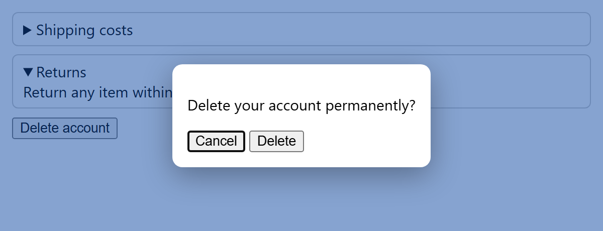
Both elements are Baseline Widely available: <details> since July 2022 and <dialog> since September 2024. Newer additions such as the name attribute that turns several <details> into an exclusive accordion, and the closedby attribute on <dialog>, are covered with the popover API in Interactive Elements.
Pitfalls: do not toggle a dialog's open attribute by hand. The specification advises against removing it manually: no close event fires, close() can no longer close it, and a modal dialog leaves the page blocked. Call close() instead. And keep links and buttons out of <summary>: the summary is itself exposed as a button, so nested controls are hard to reach with a keyboard or screen reader.