<dialog> is a box that stays hidden until you open it. Call showModal() and it becomes modal: it moves to the top layer, the browser paints a ::backdrop behind it, the rest of the page becomes inert, focus moves inside (to the element marked autofocus, if any), and Escape closes it. Call show() for a non-modal dialog that lets the user keep working on the page. A <form method="dialog"> inside closes the dialog on submit and copies the submit button's value into dialog.returnValue. <dialog> has been Baseline Widely available since September 2024.
<style>
  body { font: 15px system-ui; margin: 16px; }
  dialog { border: none; border-radius: 12px; padding: 16px 24px; }
  dialog::backdrop { background: rgb(21 101 192 / 0.35); backdrop-filter: blur(2px); }
  menu { display: flex; gap: 8px; justify-content: end; padding: 0; }
</style>
<p>Draft: <strong>Quarterly report.docx</strong> <button id="del">Delete</button></p>
<p id="log">Result: (none yet)</p>
<dialog id="confirm" closedby="any" aria-labelledby="t">
  <form method="dialog">
    <h3 id="t">Delete this draft?</h3> <p>You cannot undo this action.</p>
    <menu>
      <button value="cancel" autofocus>Cancel</button>
      <button value="delete">Delete</button>
    </menu>
  </form>
</dialog>
<script>
  const dlg = document.getElementById('confirm');
  document.getElementById('del').onclick = () => dlg.showModal();
  dlg.addEventListener('close', () => {
    document.getElementById('log').textContent = `Result: ${dlg.returnValue || 'dismissed'}`;
  });
  dlg.showModal(); // open it for the screenshot
</script>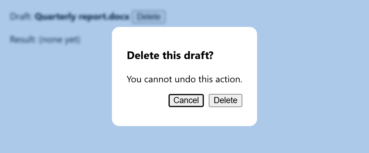
The close event fires however the dialog closes: a form button, dialog.close('value'), Escape, or, because of closedby="any", a click on the backdrop. closedby also accepts closerequest (Escape only, the default for modal dialogs) and none; it is supported in Chrome 134 1 and Firefox 141 555 but not yet Safari 10 , so treat backdrop dismissal as an enhancement. dialog.requestClose() (Baseline since May 2025) closes the way Escape does, firing a cancelable cancel event first so you can ask "Discard unsaved changes?".
Popovers
The global popover attribute turns any element into a hidden, always non-modal overlay for menus, pickers and toasts. A button with popovertarget="id" toggles it (popovertargetaction restricts it to show or hide), and opening puts it in the top layer. The default popover="auto" light-dismisses (click outside or Escape) and closes other open auto popovers except its ancestors, which suits menus; popover="manual" closes only from code or a button, which suits toasts; popover="hint", for tooltips, light-dismisses and closes only other hints, but is not in Safari yet. Popovers became Baseline in January 2025.
<button popovertarget="menu">File ▾</button>
<div id="menu" popover>
  <button>New</button> <button>Open…</button> <button popovertarget="toast">Save</button>
</div>
<div id="toast" popover="manual">
  Saved ✓ <button popovertarget="toast" popovertargetaction="hide">×</button>
</div>
Click outside the menu and it closes; the manual toast stays until its × button hides it. The beforetoggle (cancelable when opening) and toggle events report oldState and newState, and :popover-open styles the open state.
Use showModal() when the user must respond before continuing and popover for anything that should vanish when attention moves on. Never put tabindex on a <dialog>, and always include a visible close button.