BookNest's cover grid now picks its column count from the window width, using the classes of Tablets and Foldables: two columns when compact, three when medium, four when expanded. Because the value comes from useWindowDimensions(), the grid re-lays itself out when the window changes, and key={columns} remounts the FlatList, since numColumns cannot change in place (Multiple Columns):
// Window width classes from Android's guidance: compact < 600 dp <= medium < 840 dp
const columnsFor = (width: number) => (width >= 840 ? 4 : width >= 600 ? 3 : 2);
const coverStyle = { width: '100%', height: undefined, aspectRatio: 2 / 3 } as const;
// ...inside AdaptiveCatalog:
  const { width } = useWindowDimensions();
  const columns = columnsFor(width);
// ...
      <FlatList key={columns} data={books} numColumns={columns}
        keyExtractor={(b) => String(b.id)} columnWrapperStyle={{ gap: 12 }}
        contentContainerStyle={{ gap: 12 }}
        renderItem={({ item }) => (
          <View style={{ flex: 1 / columns }}>
            <Image source={cover(item)} style={coverStyle} />
            <Text numberOfLines={1} style={ui.label}>{item.title}</Text>
          </View>
        )} />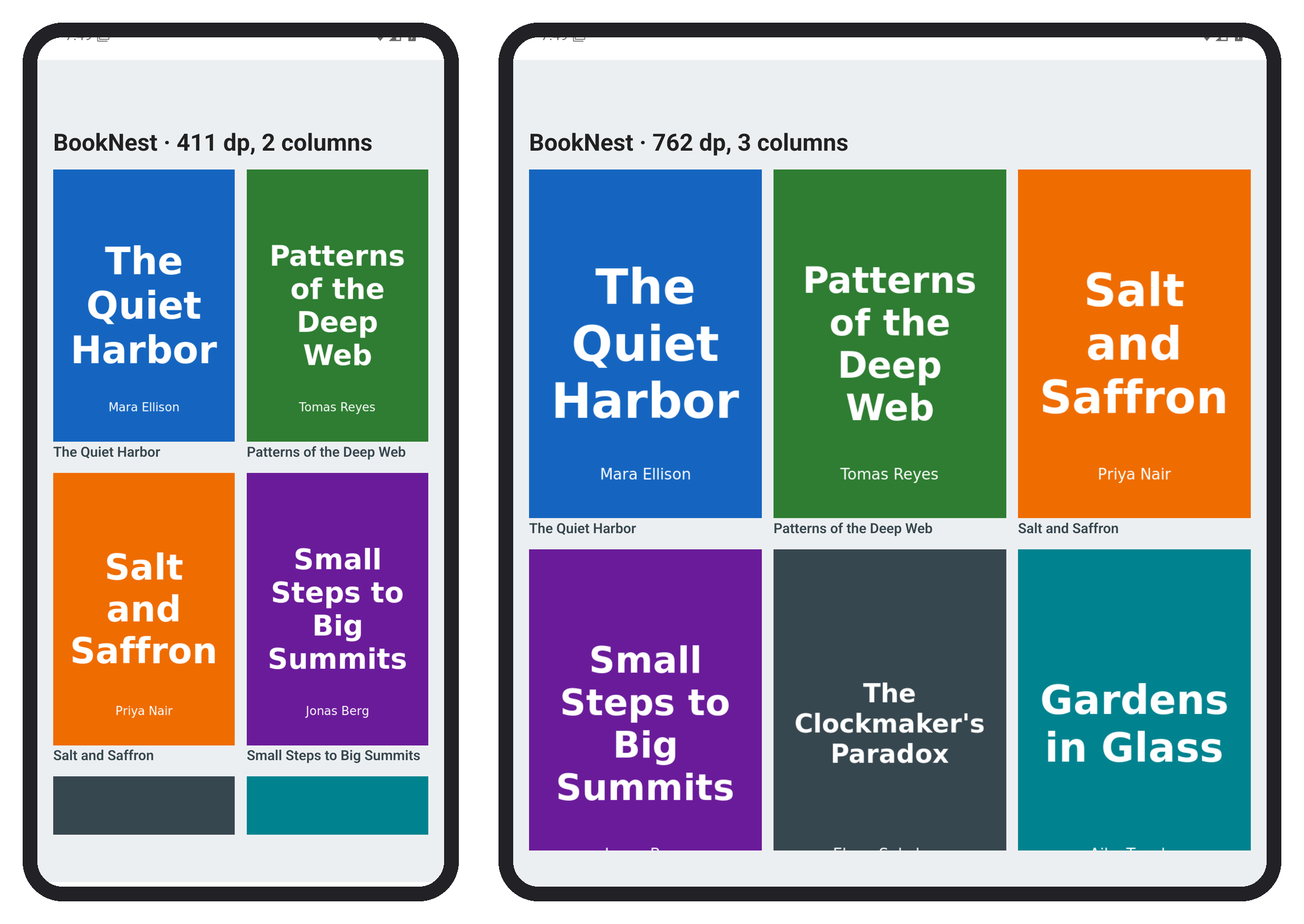
Cells take flex: 1 / columns rather than flex: 1, so a short last row keeps its cells at column width instead of stretching them. The same pattern scales up: switch to a list-and-detail layout from 840 dp, and read the width inside the component that needs it, so a split-screen window gets the compact layout even on a tablet.