The book page makes two decisions: cover beside the text or above it, and buttons in a row or a column. A custom hook keeps both rules in one place:
export function useLayout() {
  const { width, height, fontScale } = useWindowDimensions();
  return {
    width, height, fontScale,
    wide: width >= 600,              // medium width class and up (Section 3.9.9)
    largeText: fontScale > 1.25,     // big text; 1.3 arrives as 1.2999999523162842
  };
}
// ...inside ResponsiveDetail:
      <ScrollView contentContainerStyle={{ flexDirection: wide ? 'row' : 'column', gap: 16 }}>
// ...
          <View style={{ flexDirection: largeText ? 'column' : 'row', gap: 8 }}>
wm size 2000x2400 widened the window, as in Dimensions, and the page switched layout without a restart:
LOG window 761.9 x 914.3, fontScale 1 -> wide=true largeText=false
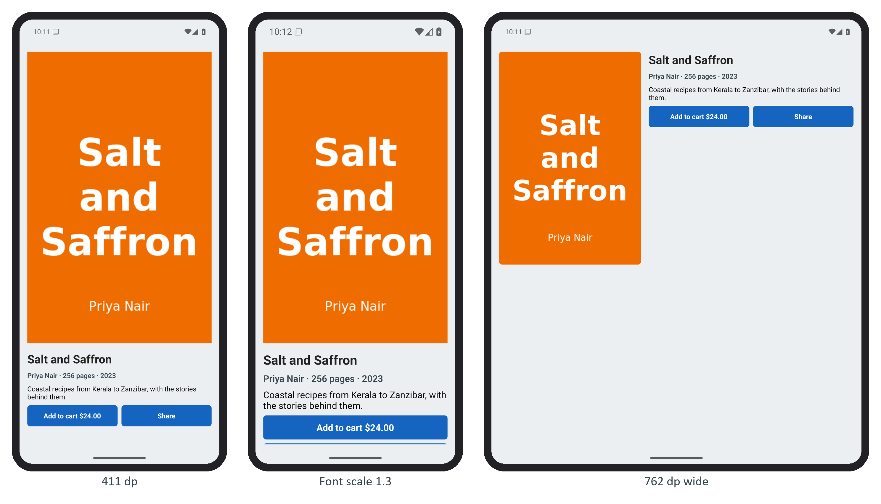
Decide by the window, not the device, and let large text change layout, not just size.