Alert.alert(title, message?, buttons?, options?) opens the platform's modal dialog: an AlertDialog on Android, a UIAlertController on iOS. It returns immediately; each button's onPress runs when chosen. The platforms differ in the details. Android shows at most three buttons and gives them roles by count: one is positive, two are negative and positive, three are neutral, negative and positive. Tapping outside closes the dialog only with cancelable: true, and onDismiss then reports it. iOS allows any number of buttons, styles them with style: 'cancel' or 'destructive', and adds Alert.prompt() for text input.
export function confirmRemove(onRemove: () => void) {
  Alert.alert(
    'Remove from cart?',                          // title
    `"${book.title}" will be removed.`,           // message
    [
      { text: 'Keep', style: 'cancel', onPress: () => console.log('kept') },
      { text: 'Save for later', onPress: () => console.log('saved for later') },
      { text: 'Remove', style: 'destructive', onPress: onRemove },
    ],
    { cancelable: true, onDismiss: () => console.log('dismissed outside the buttons') },
  );
}
Choosing Save for later, then tapping outside the next dialog, then choosing Remove:
 LOG  saved for later
 LOG  dismissed outside the buttons
 LOG  removed
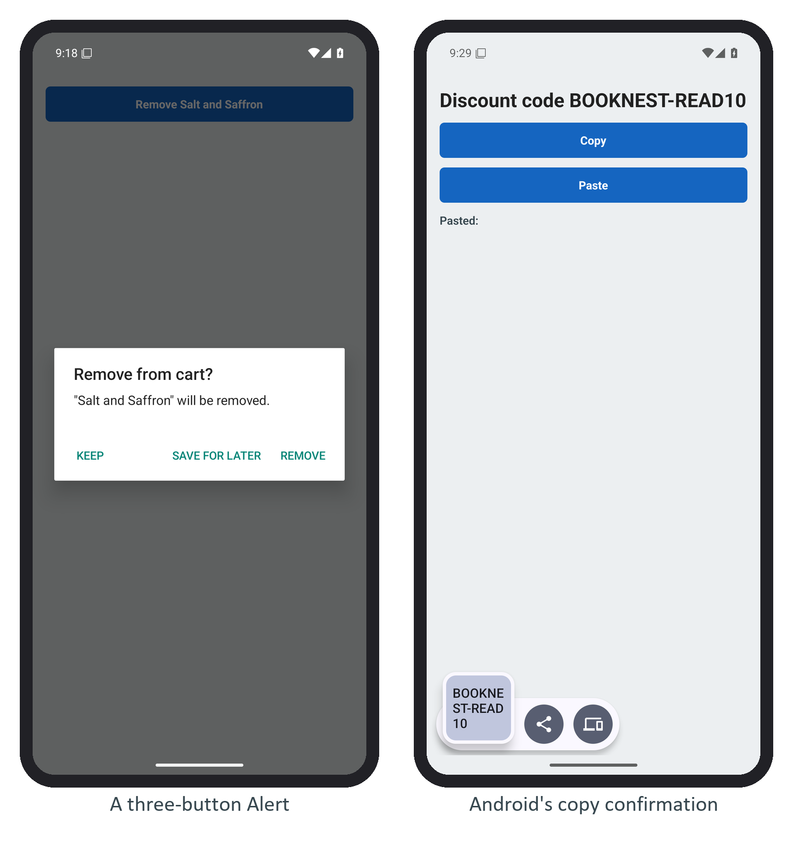
Android ignores style (no red Remove) and puts the neutral button on the left, so do not rely on order or color to signal danger: the title and button text must say it. Keep alerts for decisions that need an answer now; for information, a snackbar-style message or an inline note interrupts less, and a destructive action with undo beats a confirmation dialog.