The user needs to see the press. style and children can both be functions of { pressed }, and Pressable re-renders whenever pressed flips, so you never keep a "pressed" flag in state.
      <Pressable
        onPress={() => setTimes((n) => n + 1)}
        style={({ pressed }) => ({
          backgroundColor: pressed ? '#bbdefb' : 'white',
          transform: [{ scale: pressed ? 0.95 : 1 }],
          borderRadius: 12, padding: 24, elevation: 3,
        })}>
        {({ pressed }) => (
          <Text style={{ fontSize: 20, textAlign: 'center' }}>
            {pressed ? 'Pressed!' : 'Press me'}
          </Text>
        )}
      </Pressable>
      <Text style={{ marginTop: 24, textAlign: 'center' }}>{times}x onPress</Text>
A pressed state lasts a fraction of a second, so to photograph it, hold the touch from the host: adb shell input swipe 540 1177 540 1177 9000 keeps the finger down for nine seconds while adb exec-out screencap -p captures the frame.
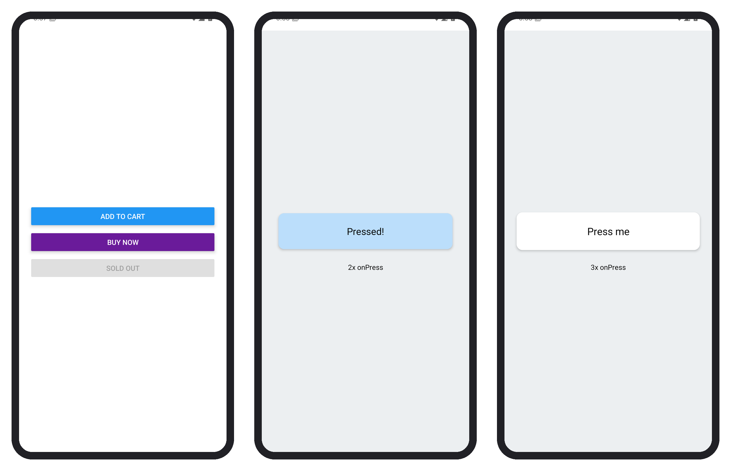
Keep pressed styles layout-neutral: color, opacity and transform repaint without moving anything, while changing padding or margin on press re-runs layout and makes neighbors jump. testOnly_pressed forces the pressed look in tests.